Nifty
Home maintenance system

Why did we design this?
66% of millennials regret purchasing their current home.
Home maintenance becomes especially burdensome when they lack the tools, information, and time to manage their homes amidst their busy lives.
"I prefer to do it myself due to cost and scheduling issues."
Home Owner
"I'd like to do it myself, unless it requires technical or special tools or has a high risk of injury."
Home Owner
"I usually search on Google or YouTube to see if it's fixable or needs to be hired out."
Home Owner
"I trust myself more than strangers."
Home Owner
"I try to take care of it myself, but sometimes I don't have the right tools or enough time."
Home Owner
"I ignore it for a little while, then write down the items needed to repair it and do it on a weekend."
Home Owner
How did we develop?
Over 4 weeks, we began with secondary research, conducting surveys and interviews with new homeowners. In the following 6 weeks, we utilized Figma for prototyping and integrated AR and tool rental concepts to streamline the home maintenance process. We also developed a rendering for the tool rental locker.
What solutions did we create?
Nifty is an all-in-one solution that simplifies home maintenance with AR-based DIY guides, expert connections, and a tool rental service, making the process easier and more efficient.

Diagnosis Your
Home Issues
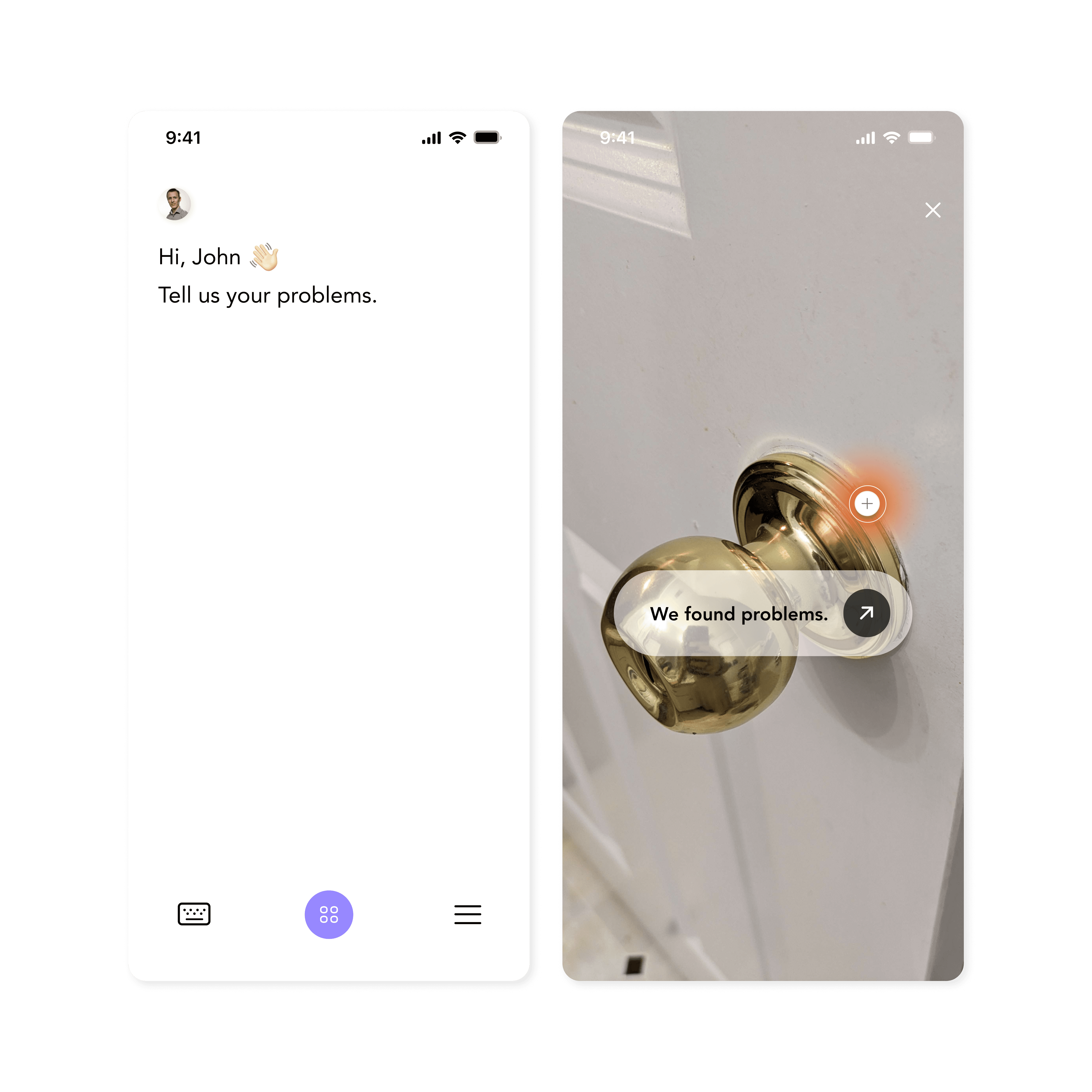
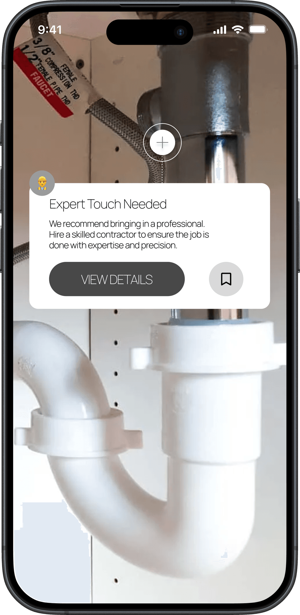
Diagnose home issues using Nifty’s augmented reality guide and fix it by giving you a step-by-step guide for connecting you to videos.
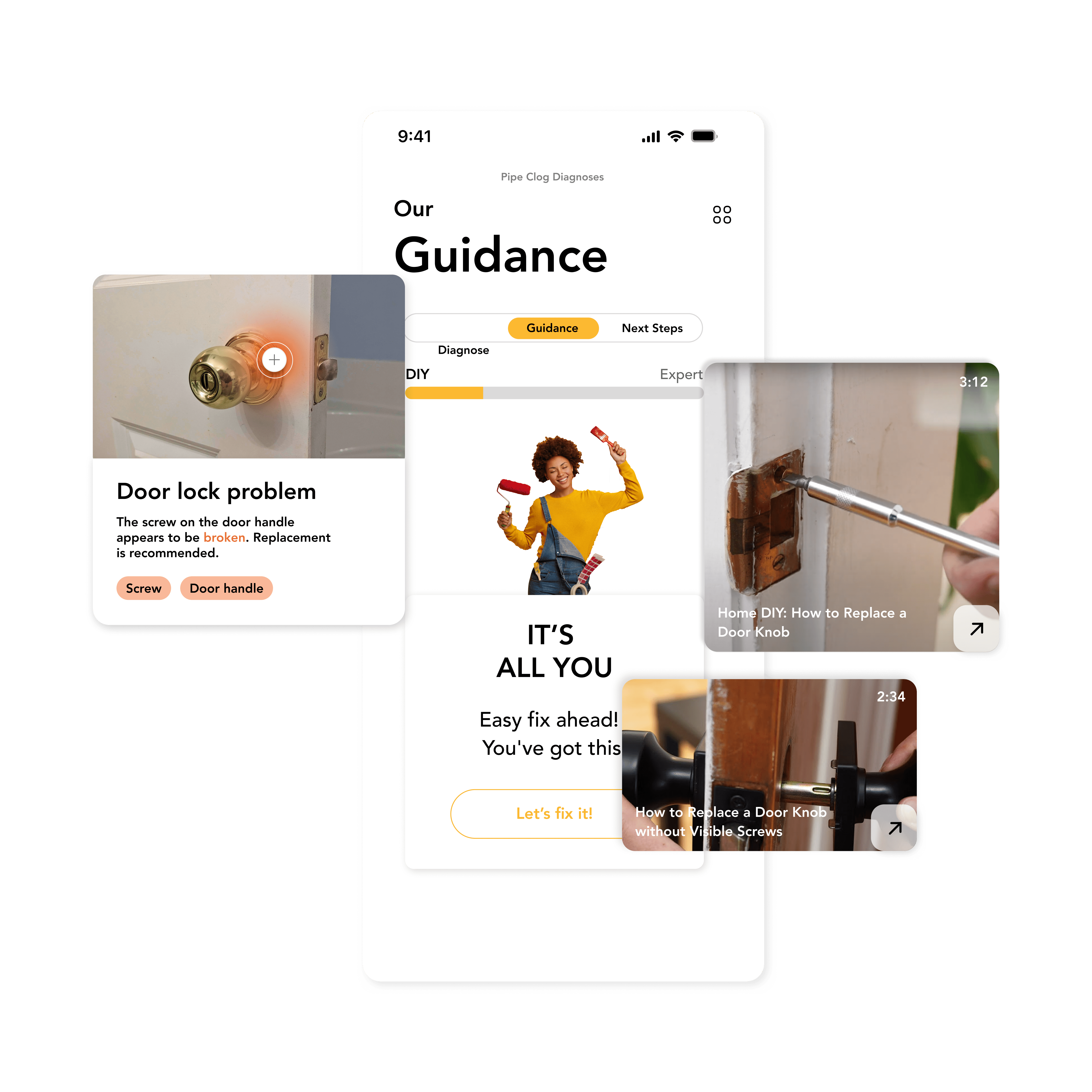
Get DIY Tips
DIY solution guides and videos tailored to precise diagnosis make it easy to fix at home.
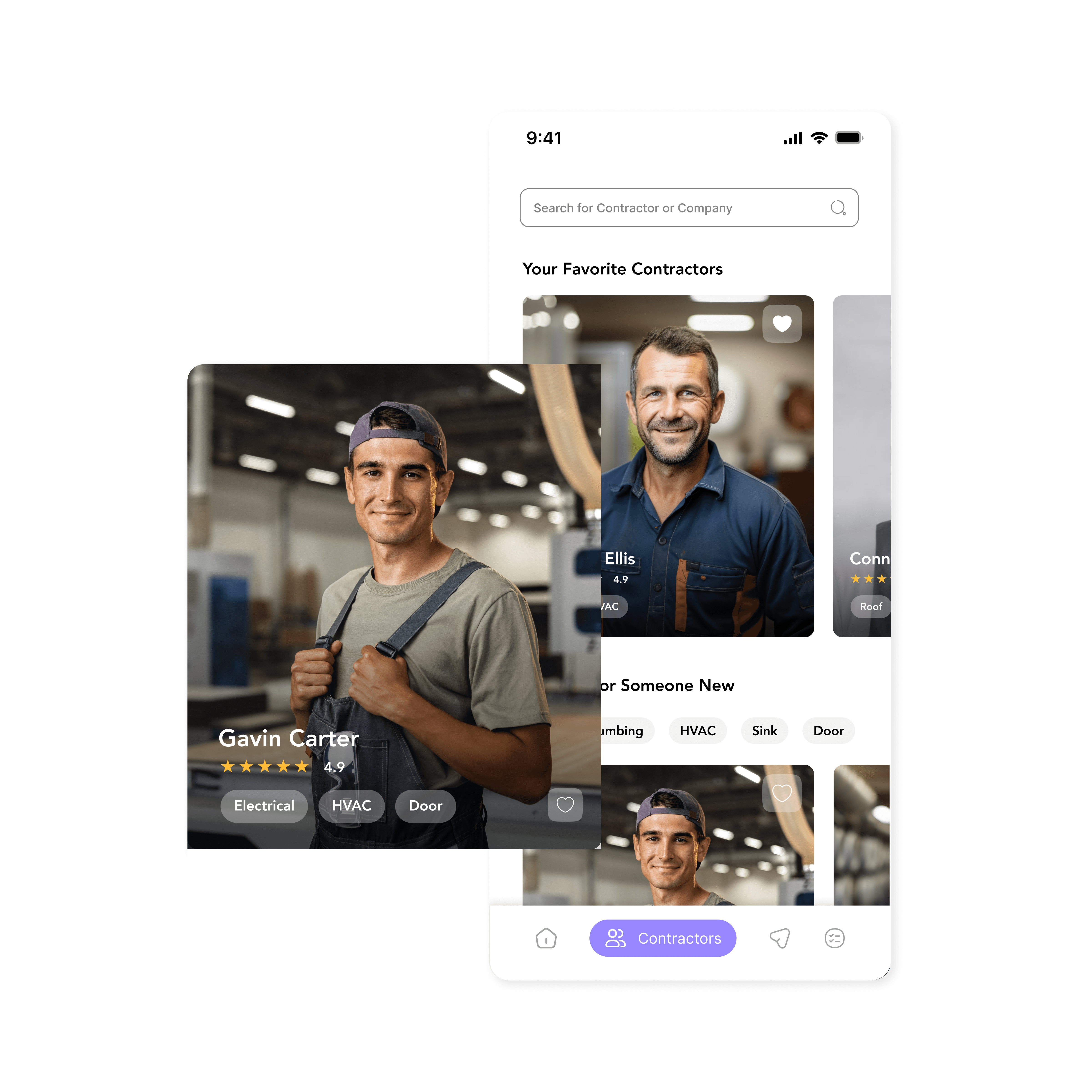
Find Reliable Expert
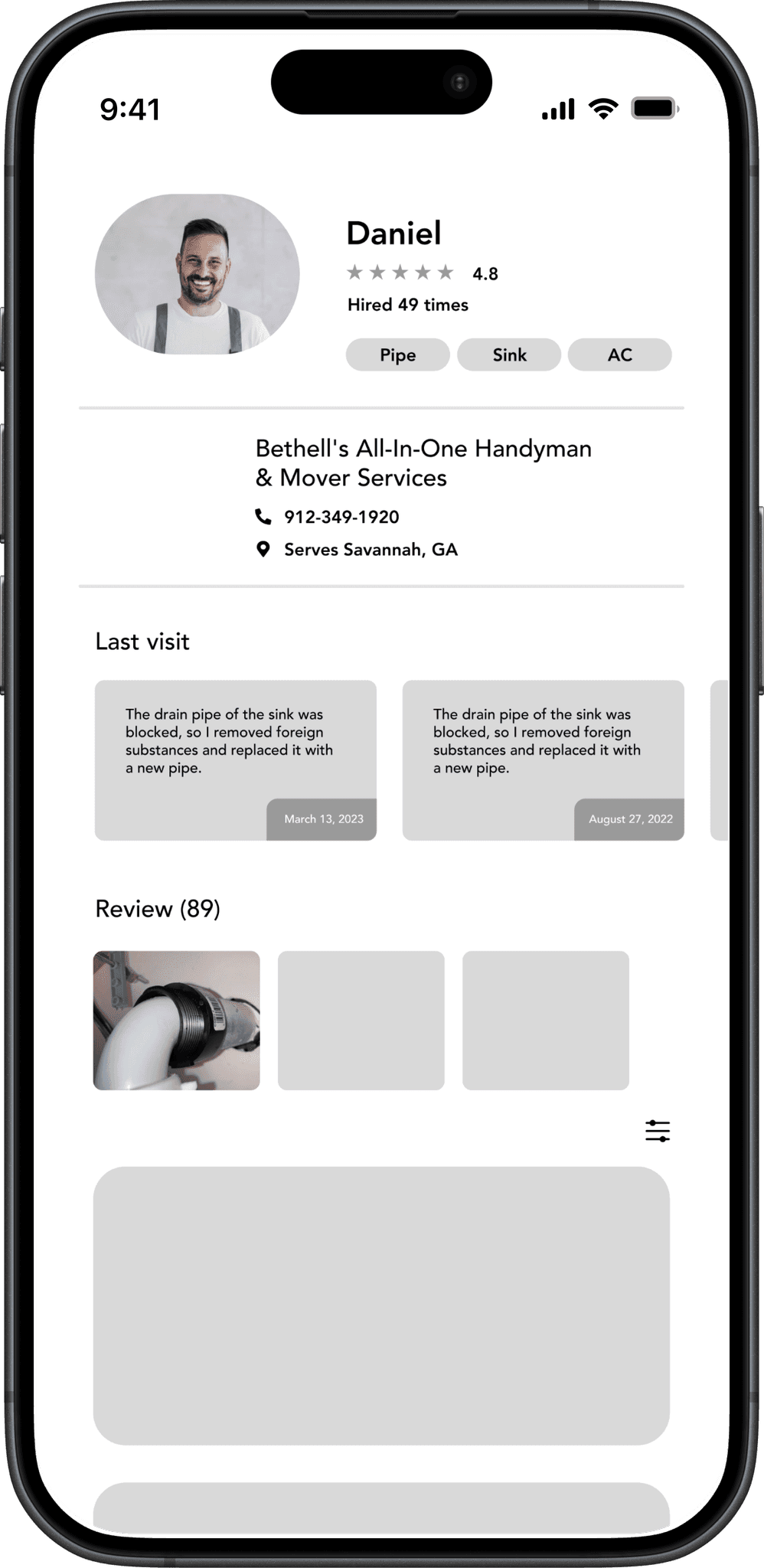
Nifty connects people with reliable experts in their area, shows ratings and specialities, and schedules time right in the app.
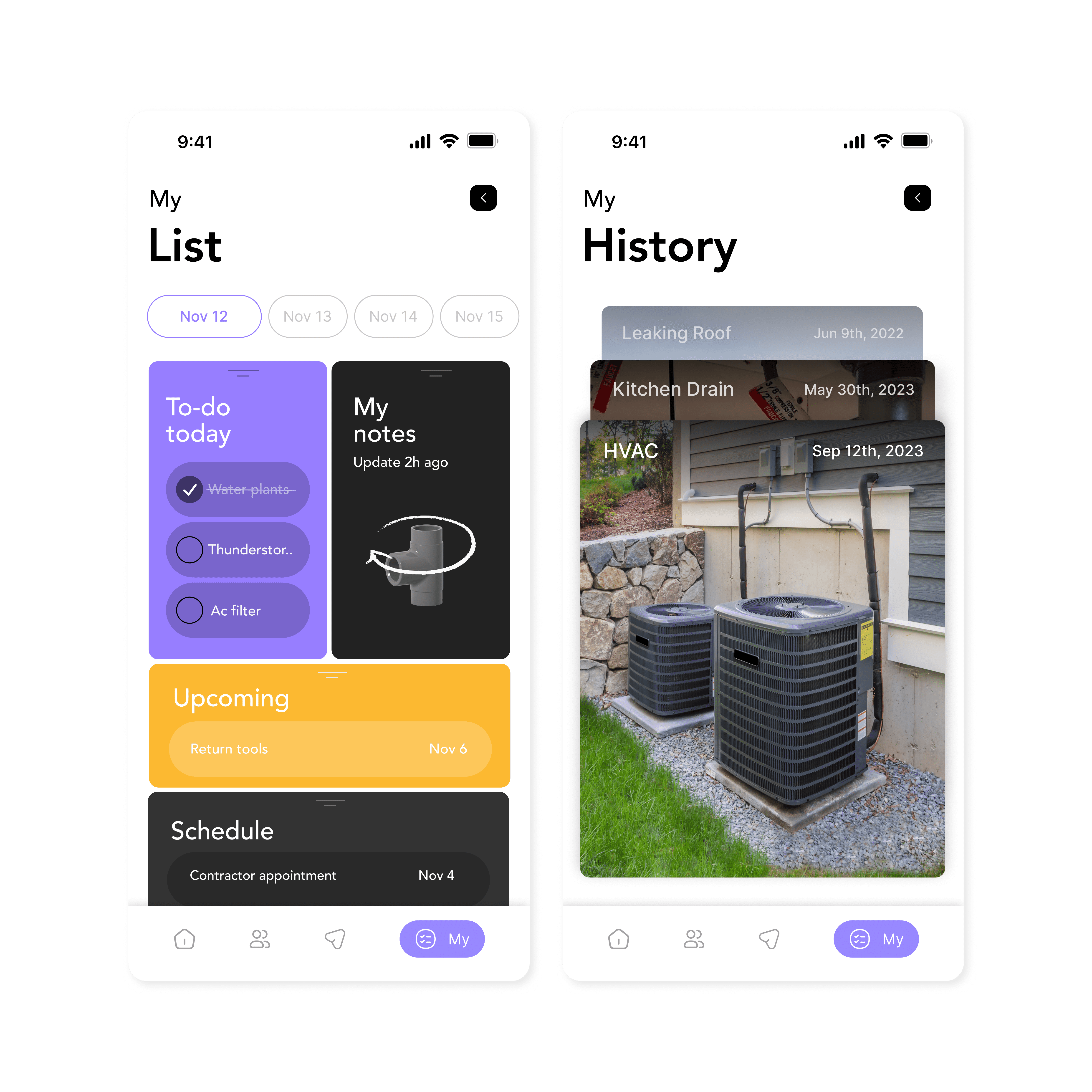
Manage Your Home
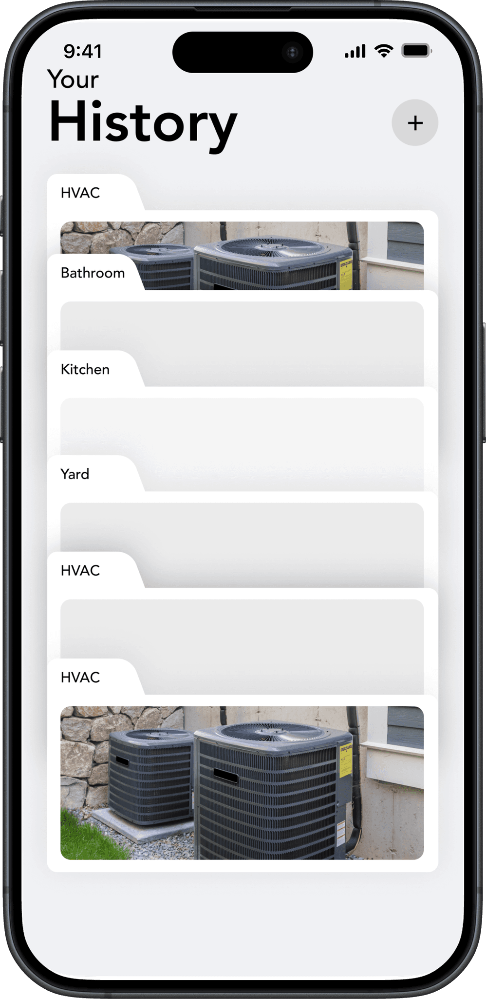
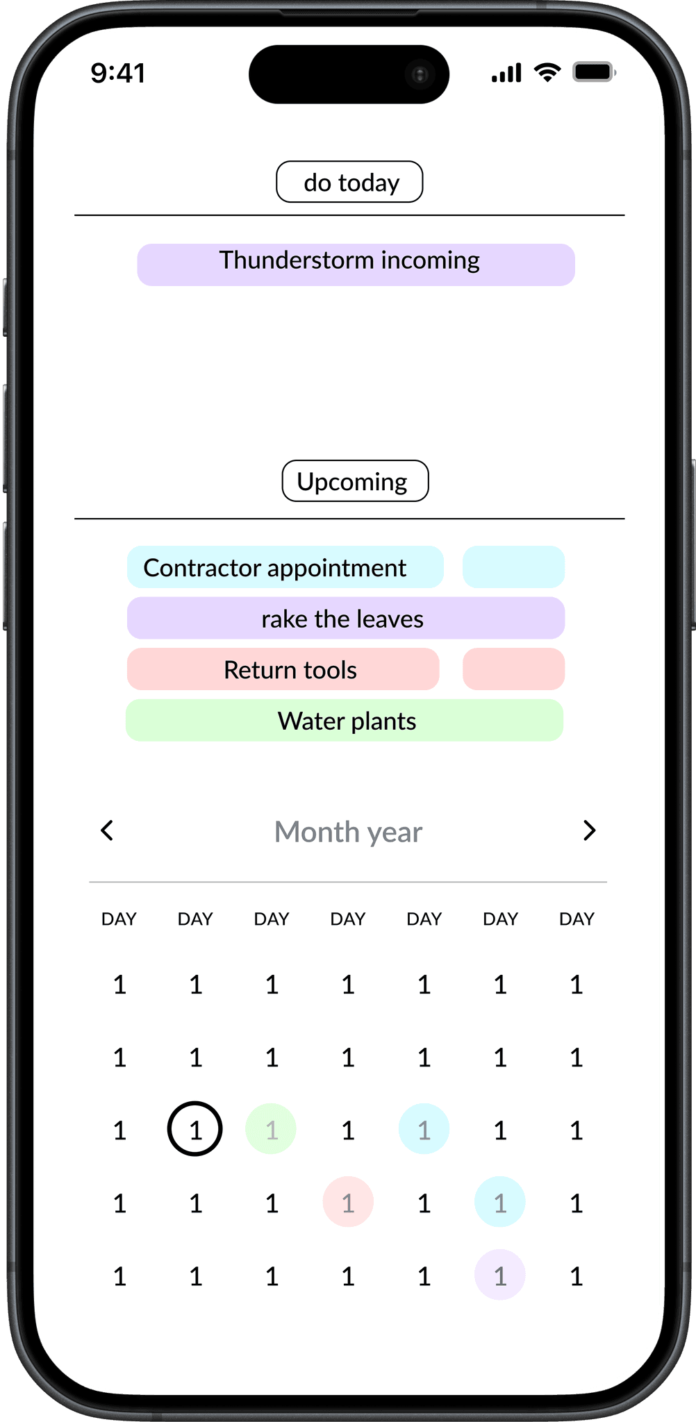
Nifty provides guidance through reminders, offering a structured overview of tasks and responsibilities.
Borrow Tools from
Rental Locker
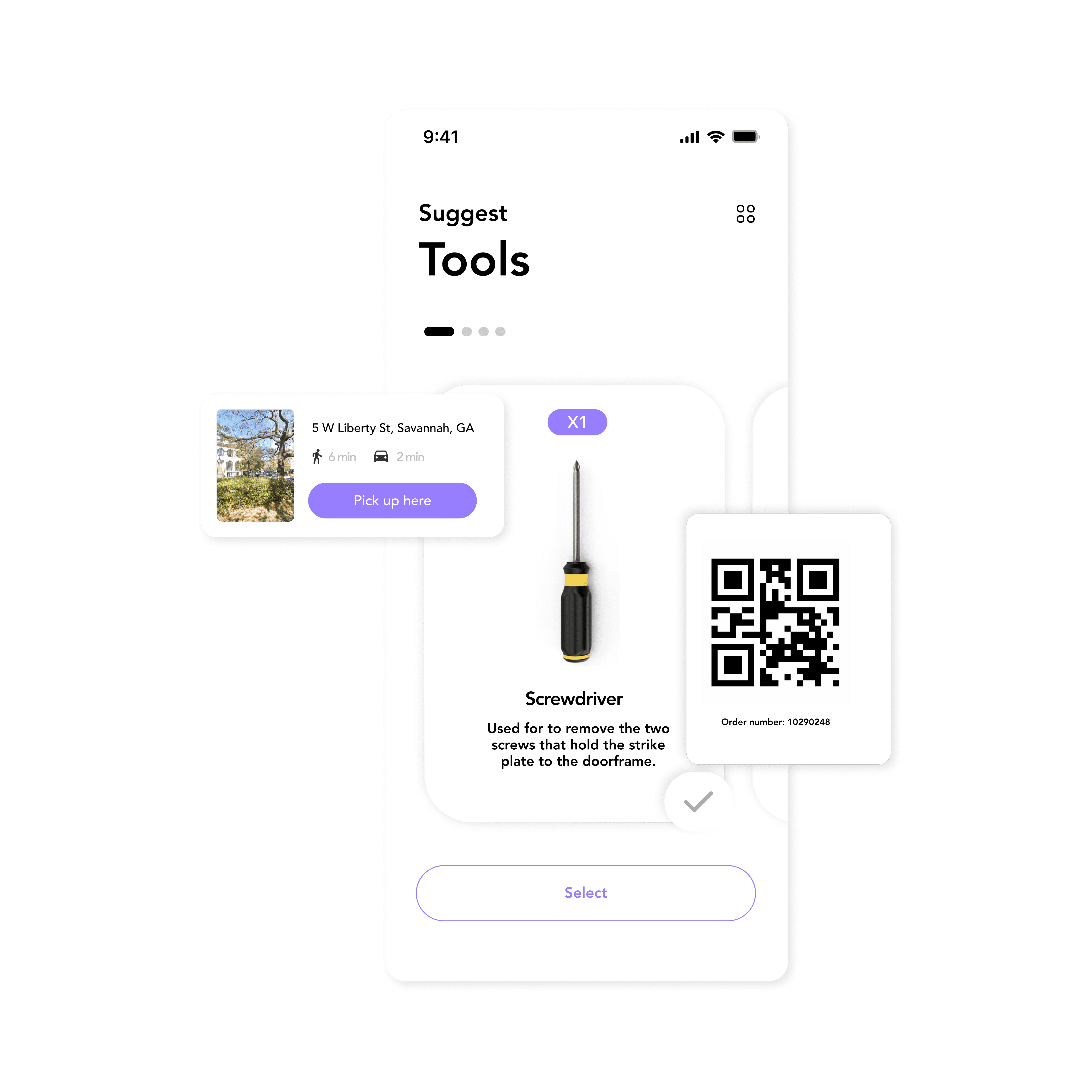
Rent tools from Nifty's locker at your local hardware store. Receive alerts for pickup and drop-off, saving time and money.
Research
Goals
Before our secondary research, we set 3 primary goals to pinpoint homeowners' challenges and ensure our solution addresses their needs effectively.
01.
What issues do people have in their homes?
02.
How do people find help with home repairs?
03.
What makes a person trust a contractor?
Secondary Research Hover the boxes to see HMWs
Millennials (ages 27-42) make up 58% of first-time homebuyers in America.
7 in 10 of millennials wait for a professional to come when they have a problem at home.
30% don't own a ladder or a level.
54% don't own a stud finder.
52% of People forget about their home maintenance tasks due to overwhelm, lake of prioritization, busy schedules, complexity.
64% of Americans call home repair pro for help after Googling DIY tips.
Things to consider: Safety, Cost, Time Available
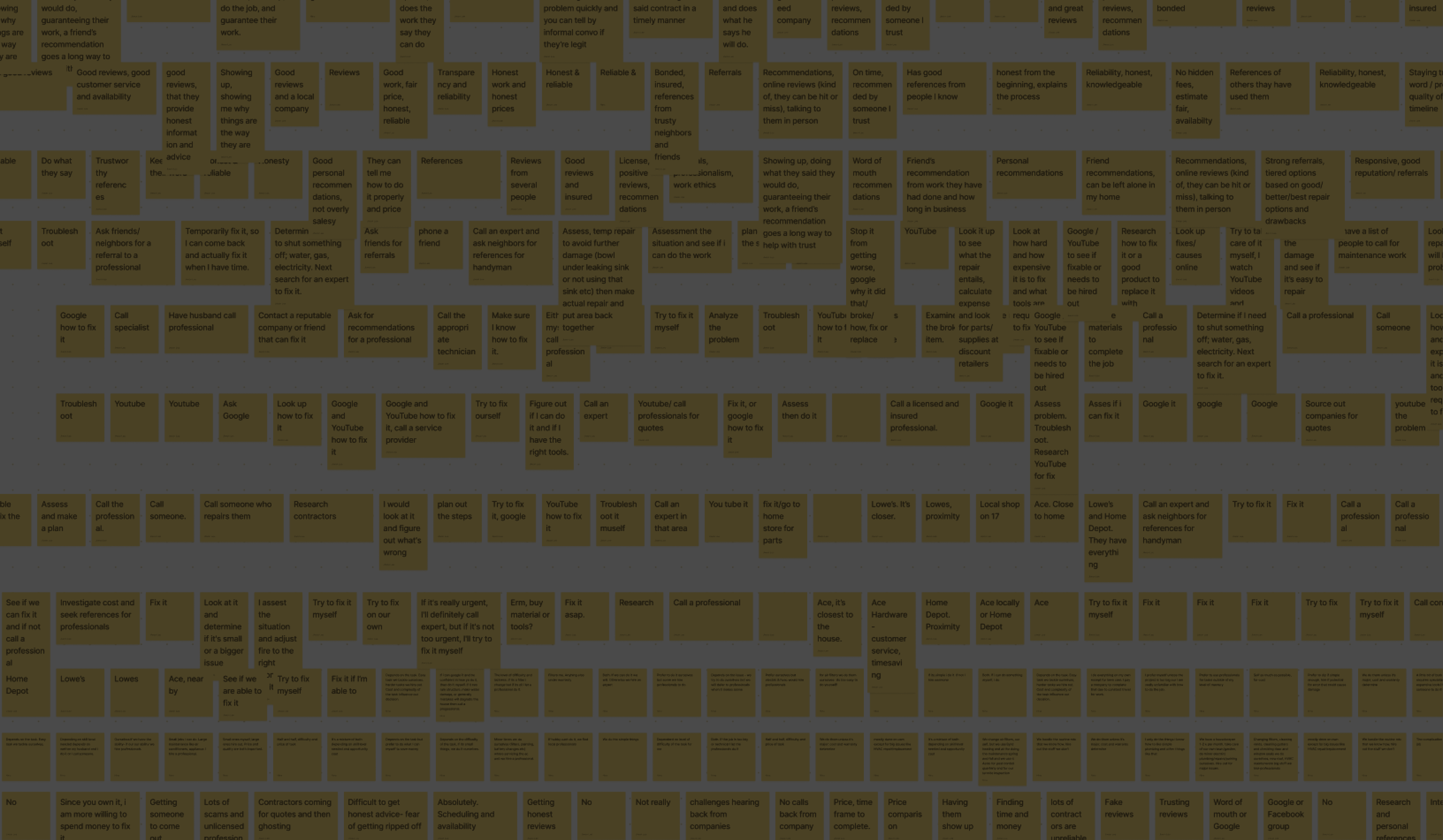
Interview & Survey
120
Survey Responses
27
Interviewees
1800
Data Points
Key Findings
Q. What would make it easier for people to do home repairs themself?
"If Youtube videos were straight to the point and clearer."
"More access to useful resources like better/more tools, classes, and better instruction."
"If I was more organized about my tasks, documents, and manuals."
Q. What makes a contractor trustworthy?
“I am more willing to trust a contractor if they talk to me about the work in a way that I can
understand.”
Q. What factors do people most prioritize when hiring a contractor?
"A contractor that charges a reasonable price."
"A contractor with a good reputation and reviews."
"A contractor that responds quickly and does the job."
Analysis
Understanding Our Users
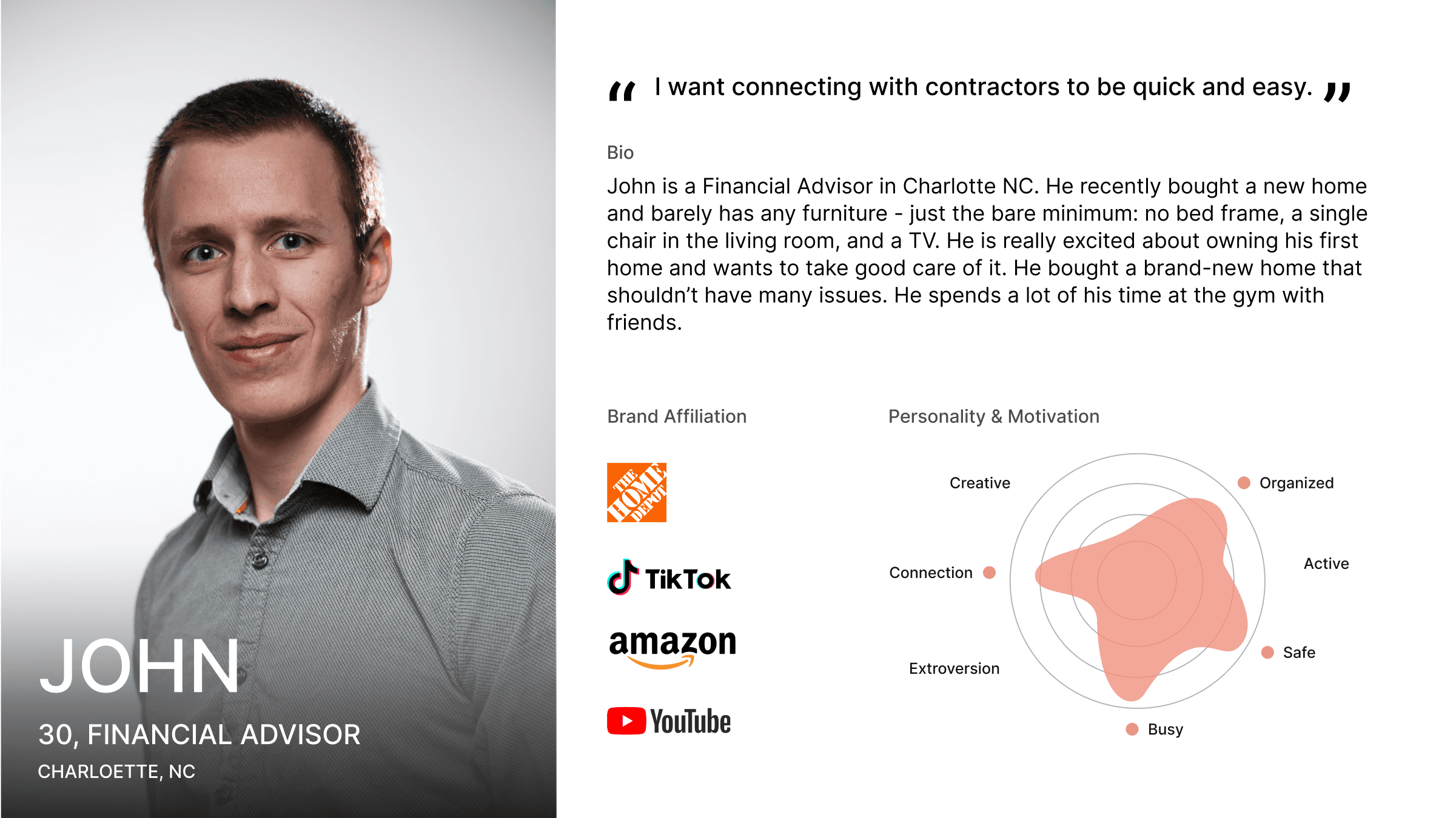
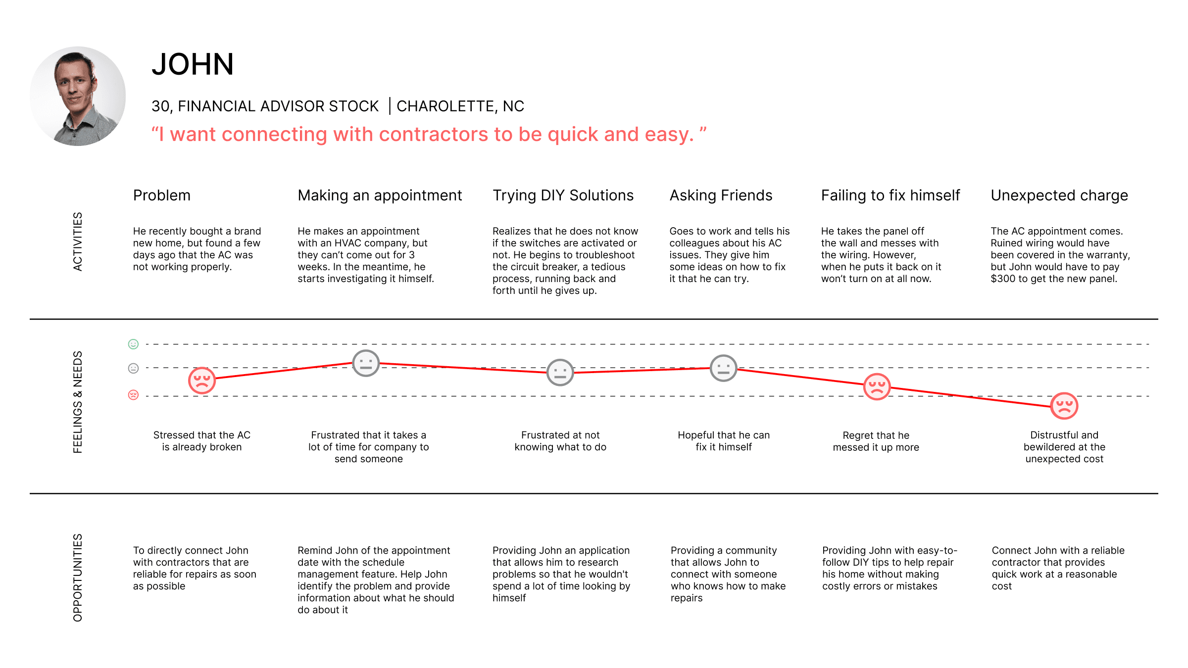
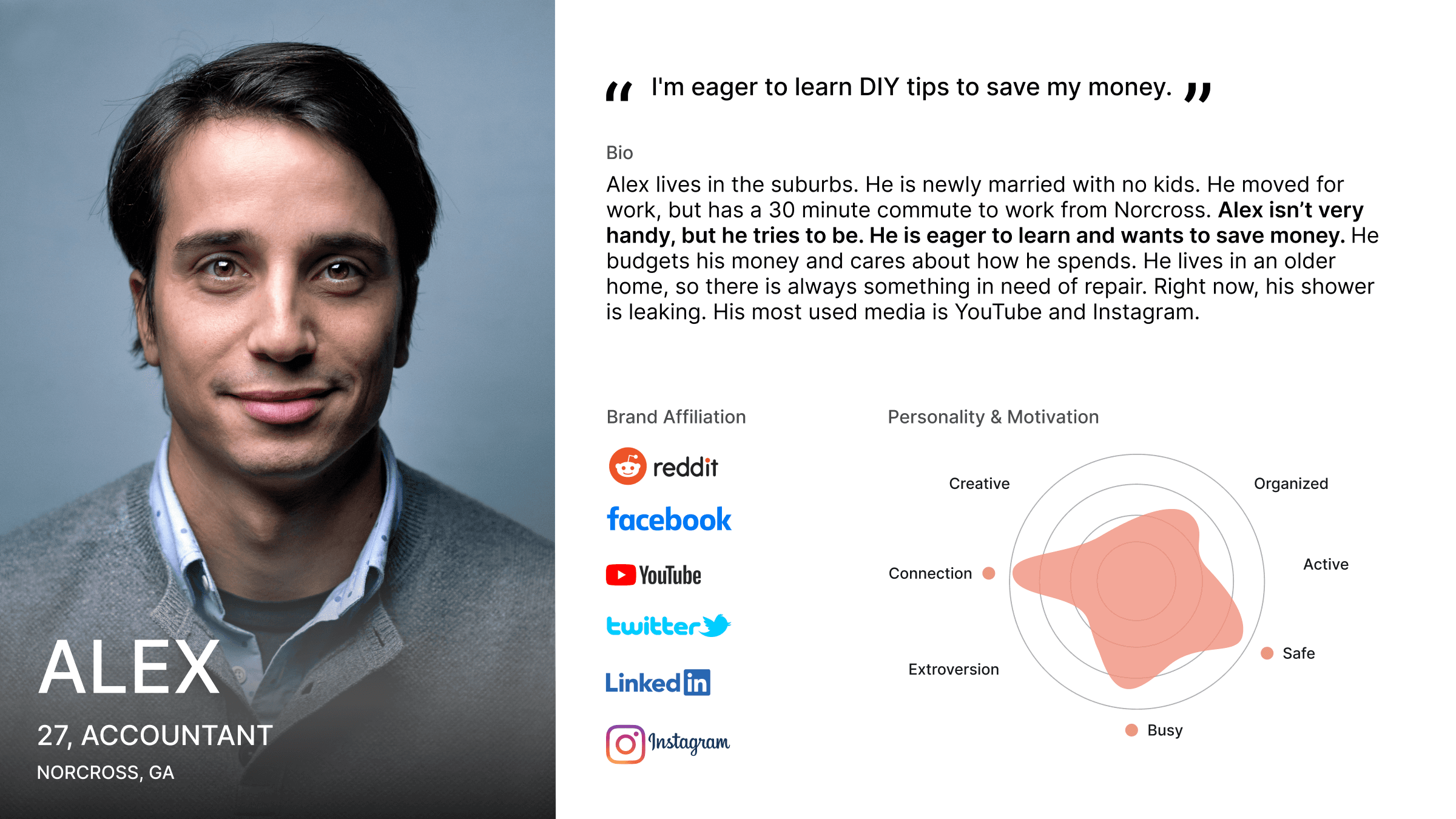
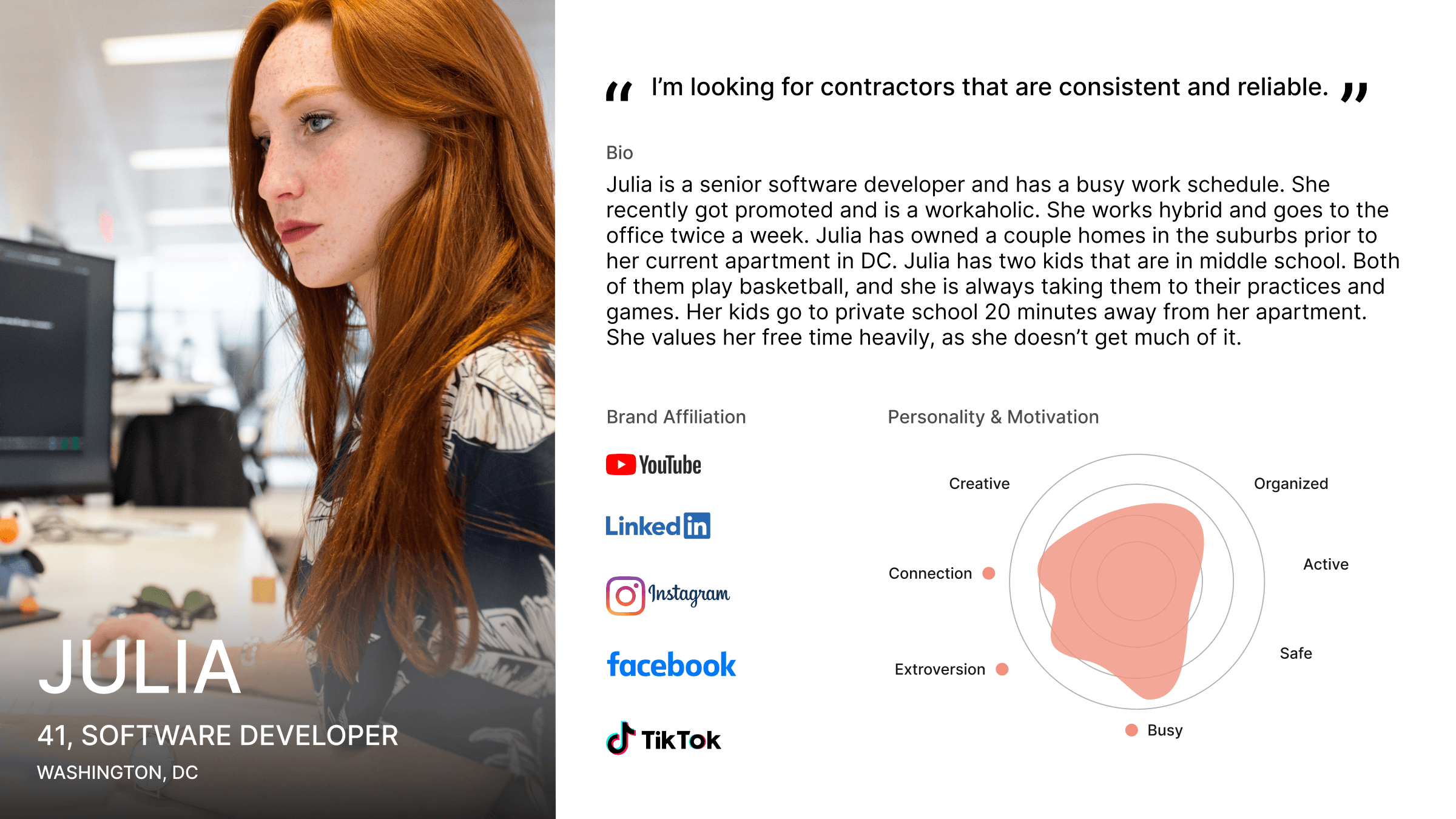
To design Nifty with our users in mind, we created personas that represent our target audience and their needs. These personas guided our decisions, ensuring the design stayed user-focused. Also user journey map helped us understand their interactions with Nifty, identify pain points, and improve the overall experience.
What I Learned
Through user testing during the UI iteration phase of our project, we learned that less is often more in practical design. Users found some sections overwhelming due to the amount of information presented, leading to a preference for a simpler, more focused experience. This highlighted the need to prioritize core functions and ensure clarity throughout the app.
Brand Identity
Color & Aesthetic
Friendly
Friendly and consistent design to make it feel approachable and manageable.
Positive
Uses encouraging writing to keep users motivated and confident in home management.
Accomplishment
Provides clear guidance and celebrates users' successful home maintenance efforts.
Typeface
Aa 12345@&!?
Avenir, with its modern and clean look, gives Nifty feel approachable and easy-to-use. Additionally, understanding that users will be reading various guides, we chose this font for its clarity and readability.
Logo
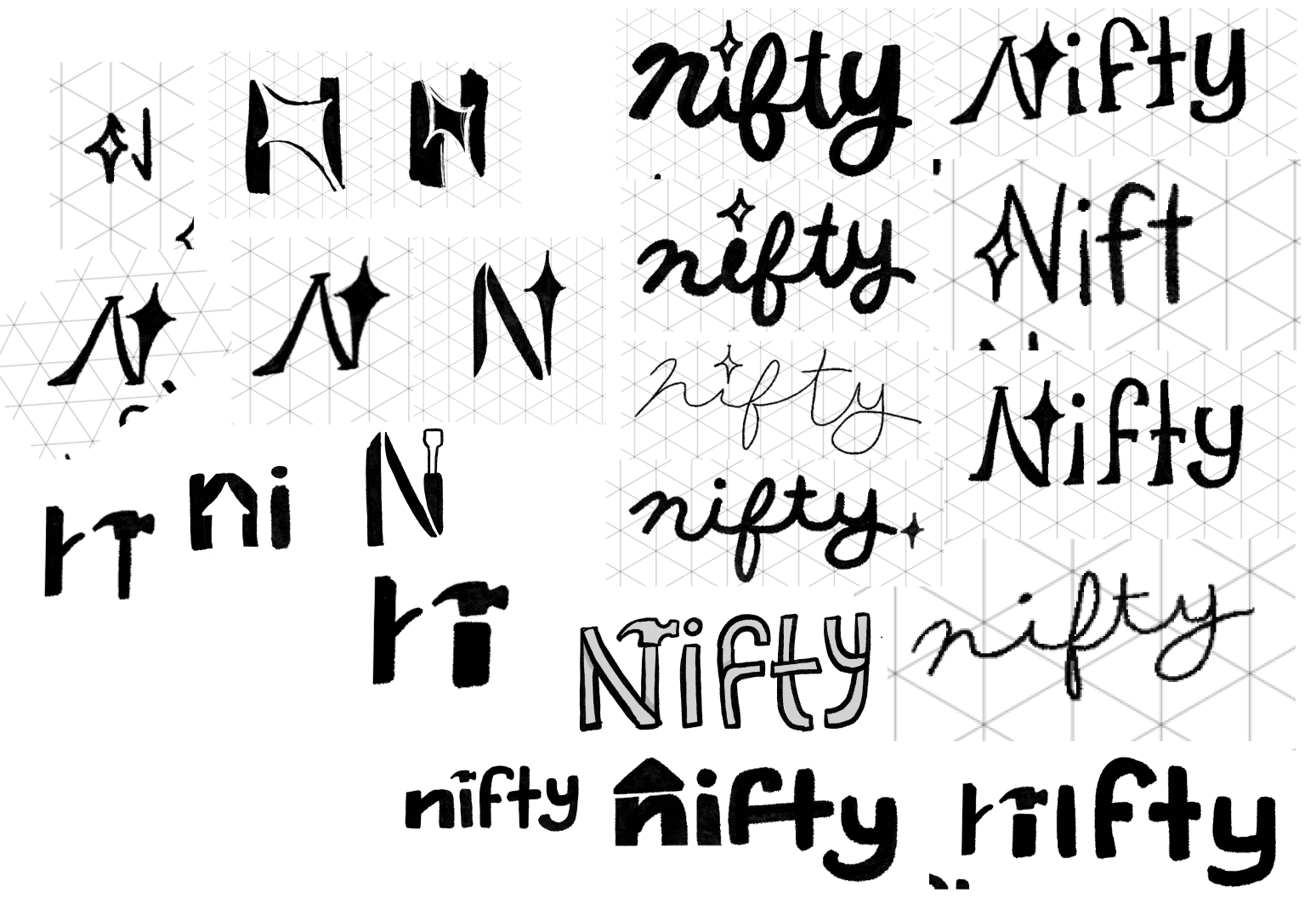
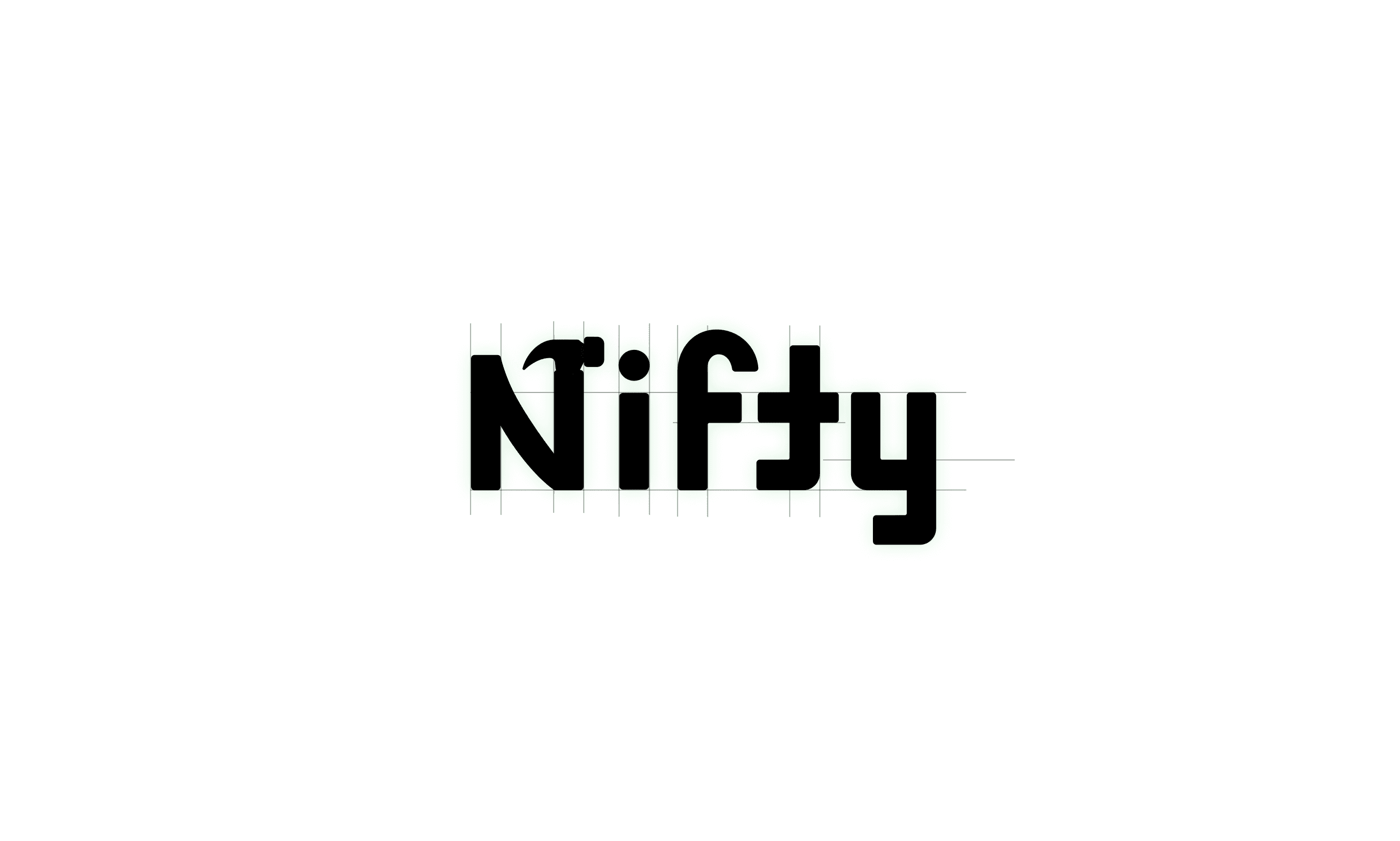
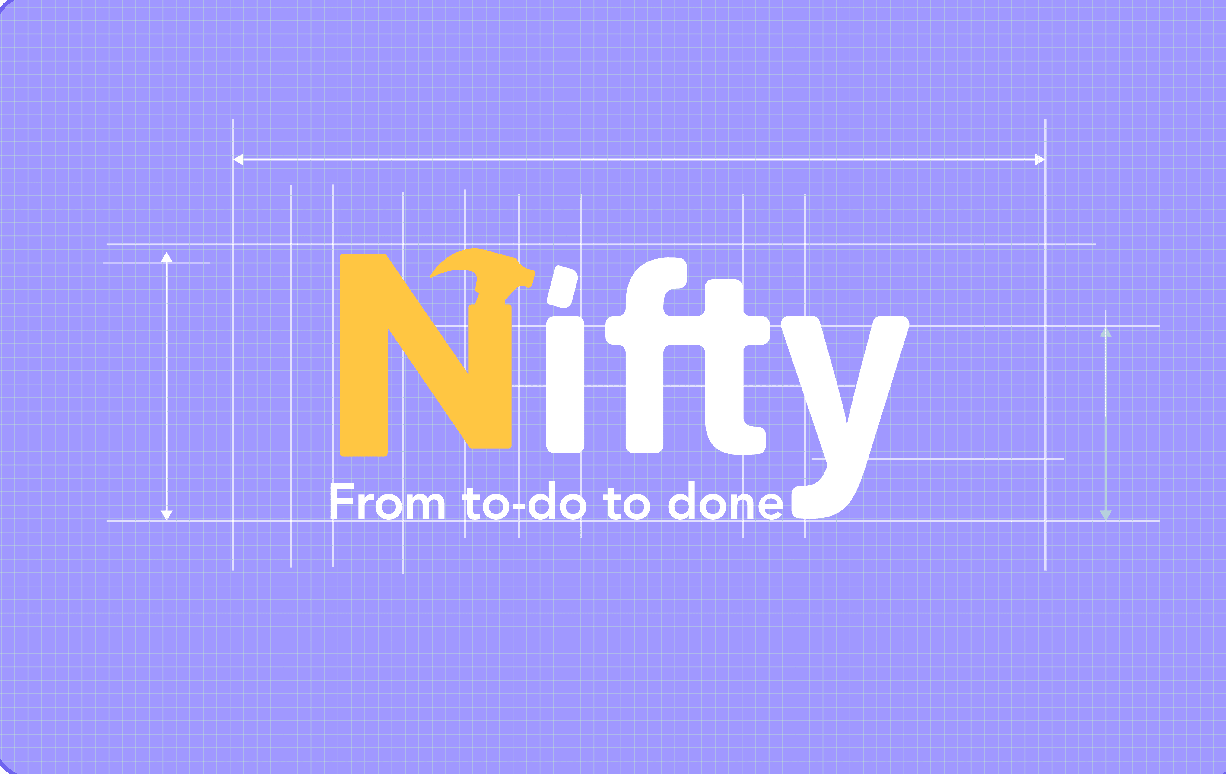
The Nifty logo incorporates a hammer shape within the "N," symbolizing home repair while maintaining a clean and friendly look that aligns with the brand's approachable nature.
Tool Rental Locker
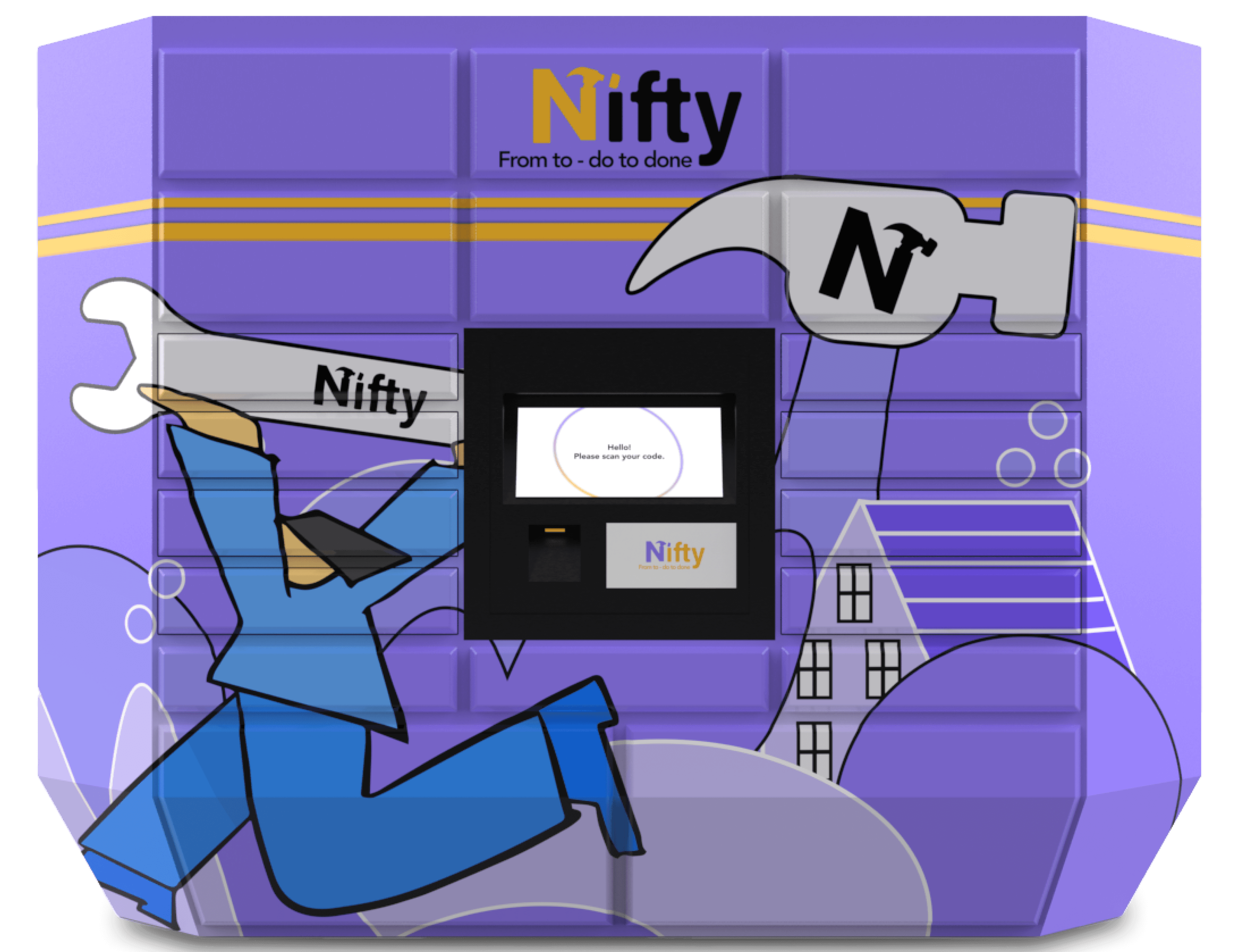
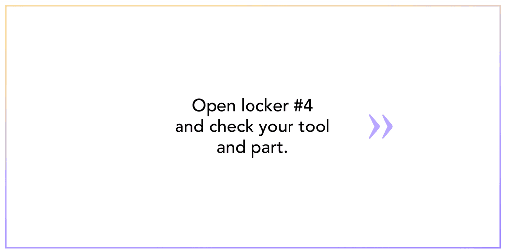
Locker UI Screens
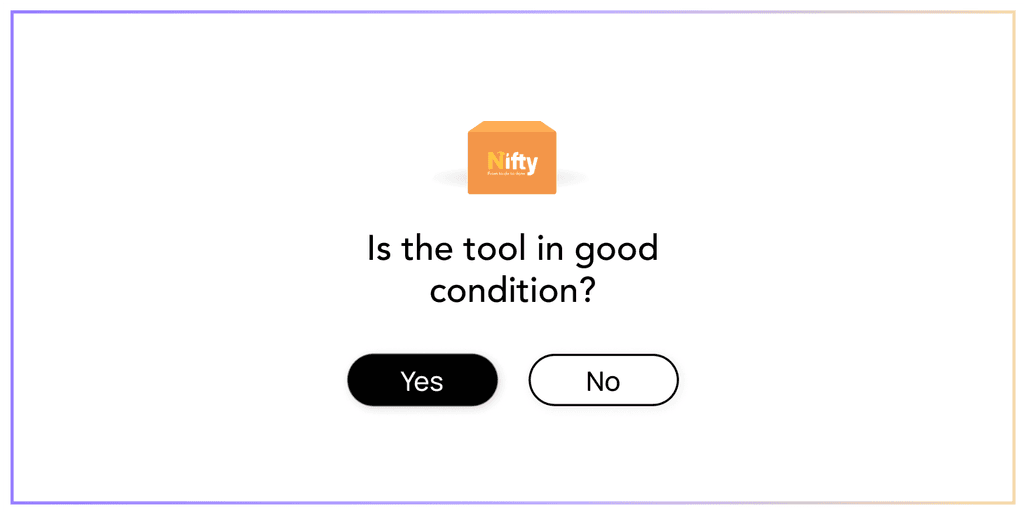
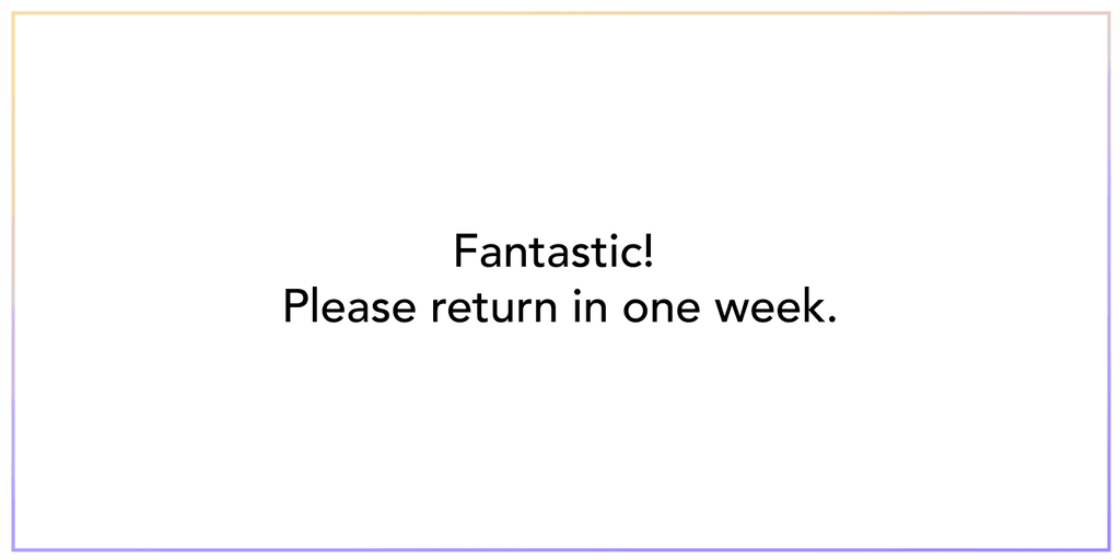
Tool Rental Locker
Illustrations

Reflection
Working on Nifty was a transformative experience that deepened my understanding of user-centered design. Throughout the process, I realized how vital simplicity and clarity are, especially when handling complex features. User testing was key in showing that even well-intentioned designs can overwhelm users if not carefully balanced. This project taught me to prioritize core functions and user needs above all, ensuring that every design choice is both purposeful and intuitive.


